Branding
Website
Merchandise
Packaging
May 2019
Febuary 2020
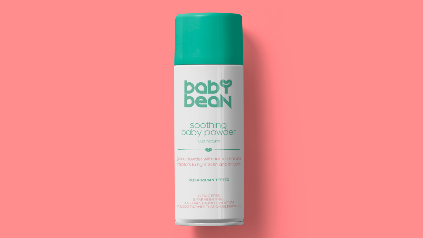
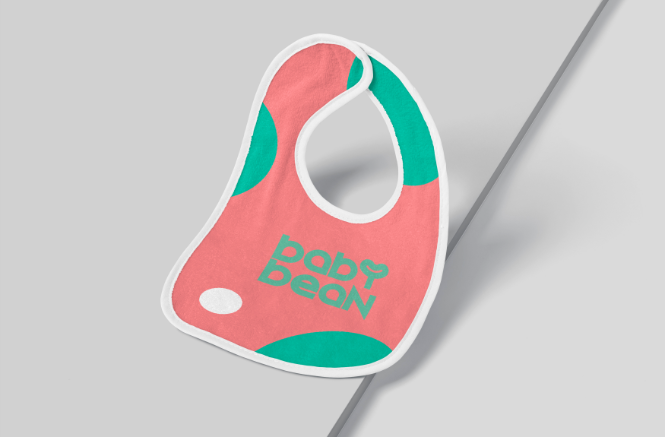
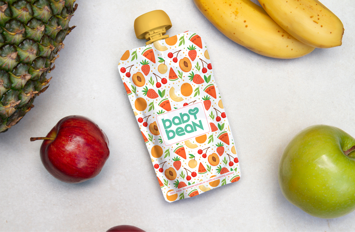
Baby Bean’s mission was to equip busy, health-attentive parents with organic, natural and healthy baby products that they could wholeheartedly trust, from soothing baby powder that fights rash and irritation to juice with no preservatives or artificial colouring. They needed to deliver that message loud and clear through their branding and packaging, even before people flipped their products over to check out the ingredients.


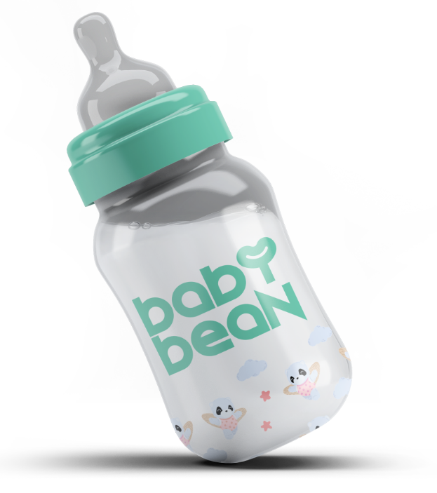
“Bean” is more than a term of endearment – it’s part of the Baby Bean identity. That’s why we incorporated its shape right into the brand’s wordmark, as part of the “Y”. Look a little longer, and you’ll notice it’s also a beaming smile. A freshly sprouted plant. A squishy, soft heart. Even a pair of arms wrapped around something precious. That’s no accident – it’s everything Baby Bean stood for.
In every bit of Baby Bean’s packaging, we nestled colours, images and shapes that evoke the ingredients inside, from the scrumptious vibrancy of fruit to the soft, soothing comfort of baby powder. Add to that a font that evokes the shapes found in leaves (after all, their products are 100 percent natural!) and a powdery green-and-pink palette, and you’ve got a design fit for your baby!
 Back
Back
 get in contact today