
When you’ve created as many brands as we have, you know a few things by heart – like good brands start with a seed of inspiration, while incredible brands evolve that inspiration into a fully-grown concept via a careful design process.
So obviously, we needed to put our money where our mouth is for our own branding. We needed to create something extraordinary.
O Digital is bold, brilliant and uniquely memorable. Everything we create – from logos to websites, from videos to social campaigns – is, too.
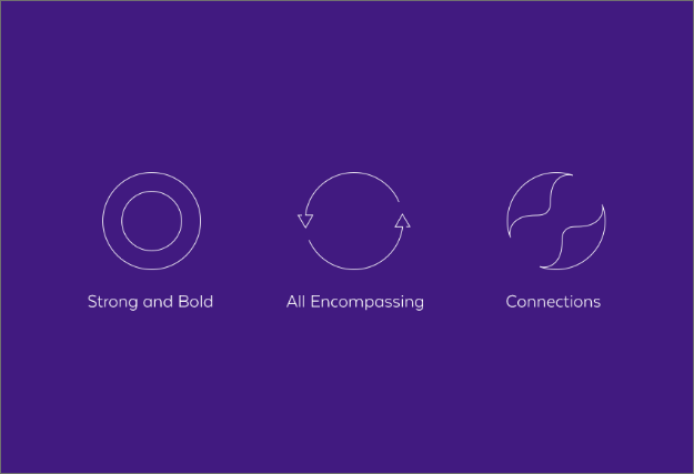
Our “O” had to be much more than one of 26 letters in the alphabet.
It needed to stand on its own, strong and independent. It needed to convey the passion, creativity, diversity and evolution of our business.
It needed to capture our originality, obsessive attention to detail and openness. It needed to set the bar high for what we deliver to clients.
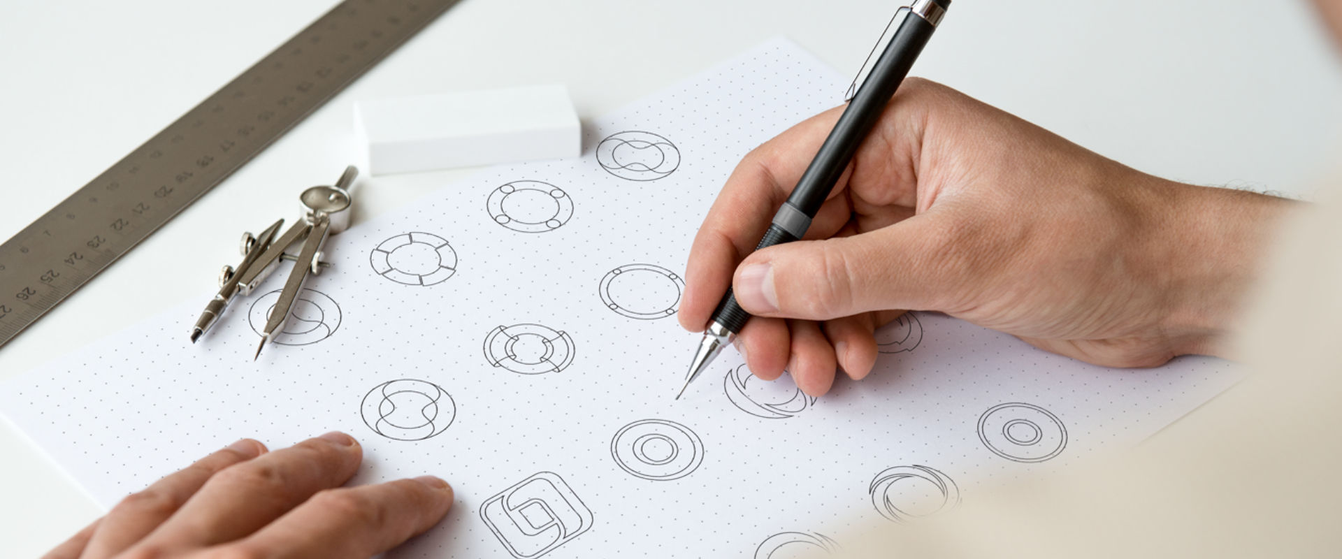
It’s called “the creative process” for a reason: it’s a process! We tackled our own logo like we tackle every project we create, pouring our deep understanding of identity, values, market and design into each concept and sketch.
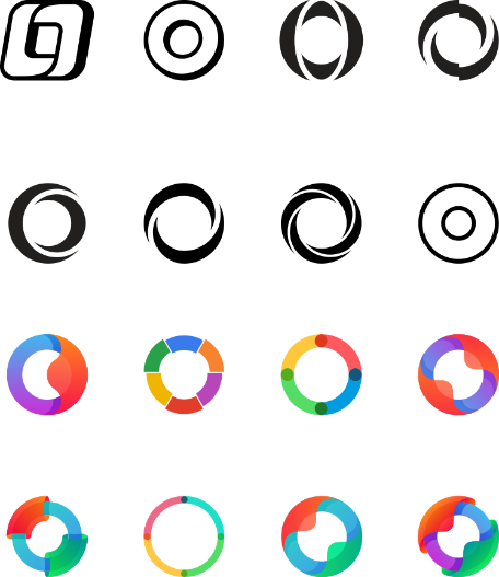
We experimented and tested different concepts until we landed on one that was as bold, fluid and intuitive as we are.

Every detail matters, down to the last pixel. Nailing the perfect curve, line weight, spacing and proportions… these are the small details that might not seem obvious, but look messy if they’re slightly off. Good thing we’re excited by the little things.

Without uttering a single word, colour can evoke feelings, spark ideas, communicate messages and tell a story.
The story we wanted to tell? The diversity of our work,
the creativity of our team and the quality of our results.

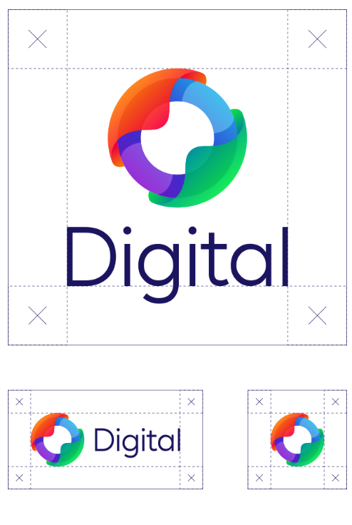
It's more than picking a typeface from a drop-down menu.
The typography we chose had to reflect our brand's personality,
attract (and hold) attention and build our brand recognition,
all while being clear and easy to read across different media.
It's more than picking a typeface from a drop-down menu. The typography we chose had to reflect our brand's personality, attract (and hold) attention and build our brand recognition, all while being clear and easy to read across different media.

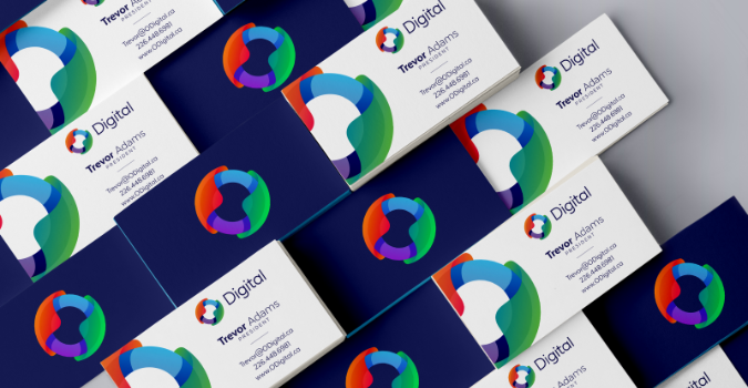
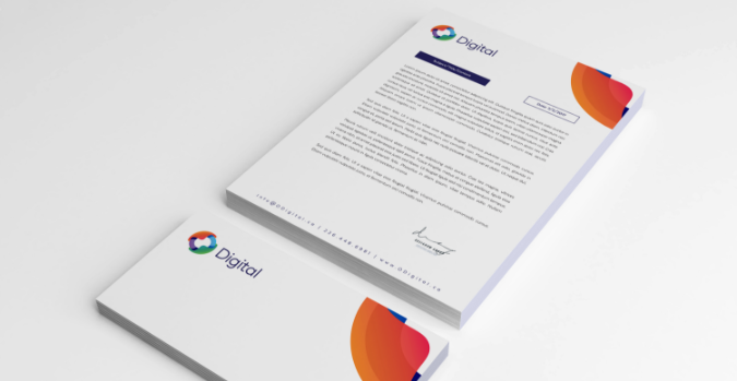
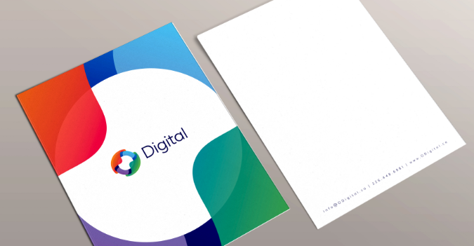
Our brand is so much more than our logo. It tells the world who we are, what we do and how we do it at-a-glance, whether it’s on your phone, a website, a business card, a letterhead or a folder.
No matter where you see our brand, you see something extraordinary. You see the talented people who bring creativity to life. You see what we stand for as a business. And you see what we’re capable of achieving.
Cool, huh?
We poured our passion into creating our brand, and we’ll do exactly the same for your business. You can expect the exact same level of passion, commitment, creativity, expertise, attention to detail and dedication from us that you see here.
Ordinary won’t cut it. You need an agency as brilliant as your business, and we’re everything but ordinary. Kick good to the curb and embrace incredible.