Branding
Website
Merchandise
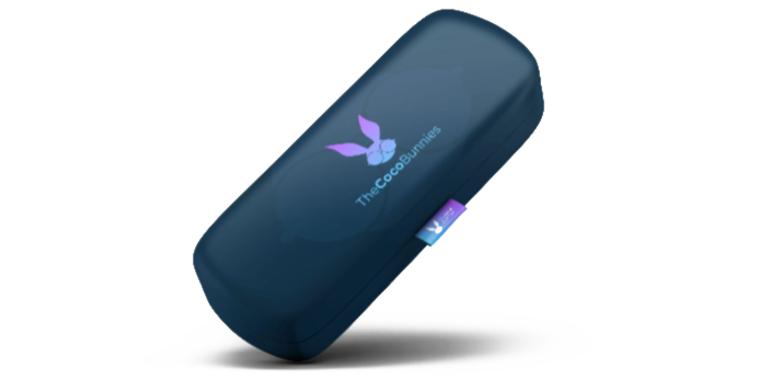
Packaging
December 2020
May 2021
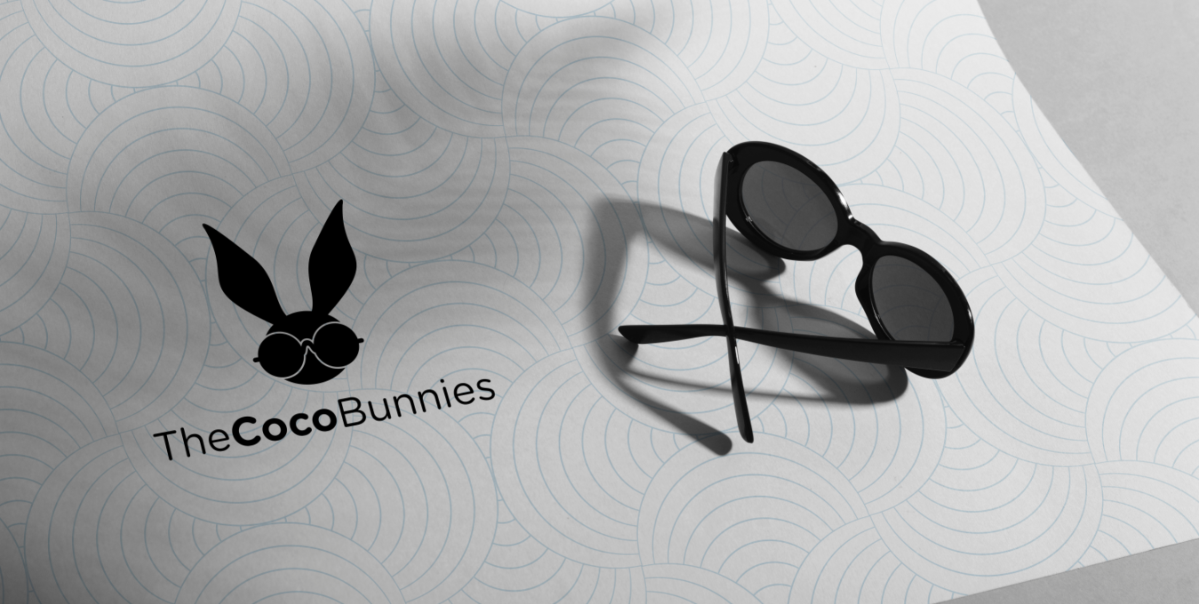
Eyes may be the window to the soul…but a great pair of glasses? They can say more about you than anything else you wear. Eyewear designer The Coco Bunnies wanted that statement to be bold, edgy, playful, free-spirited and iconic. And they wanted their branding to be the same, across their entire line of merchandise.
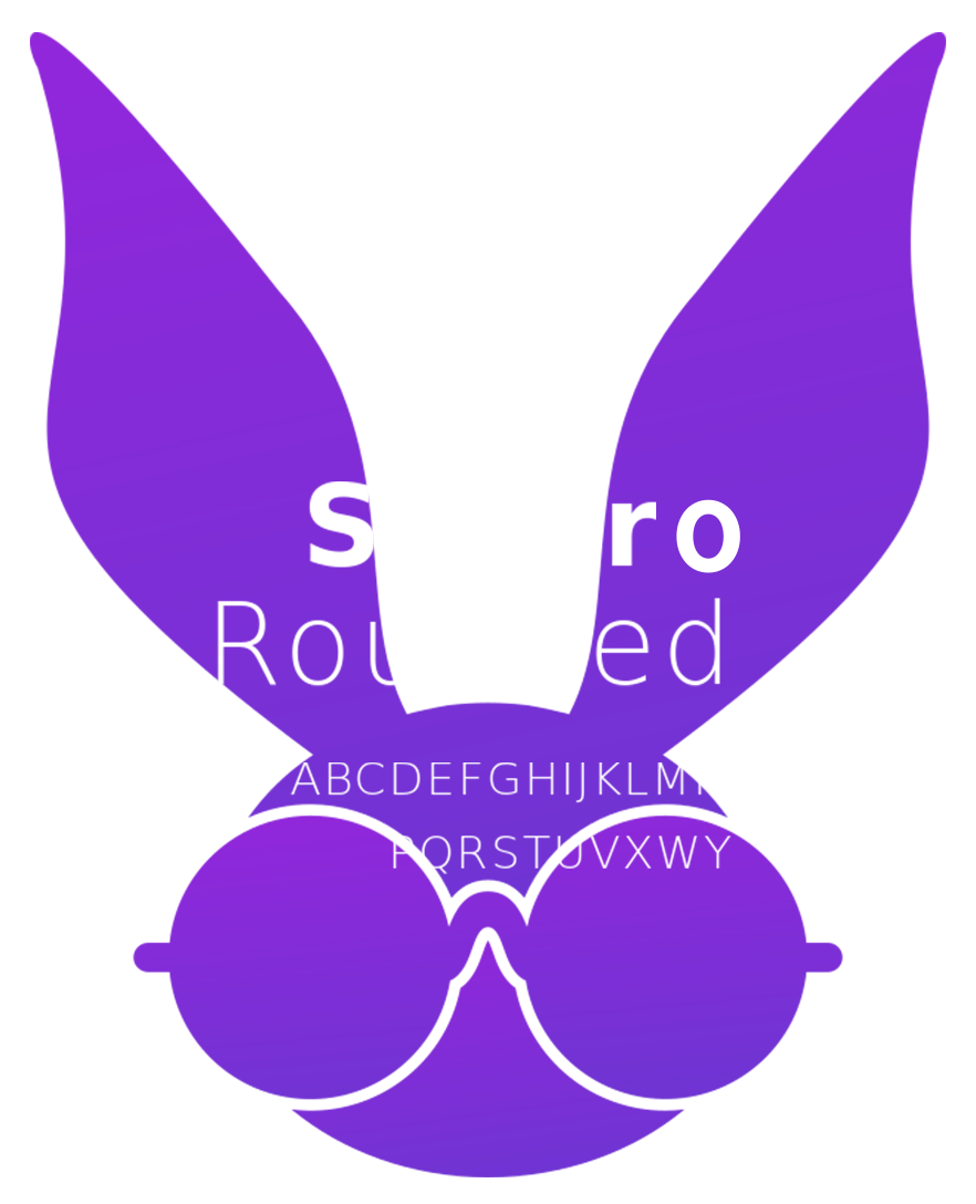
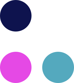
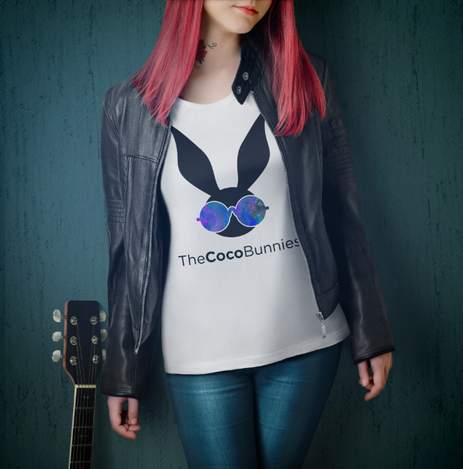
We started with a dynamic palette that emphasizes both light and dark for a bold contrast. Paired with a not-quite-neon magenta-to-turquoise gradient, the electrifying combo pops off the screen, page, package, label or even
t-shirt. We put the same level of care into the font choice, opting for a rounded typeface that complements the rounded shapes of The Coco Bunnies’ logo and grounding the brand’s playfulness in something fresh yet simple without overpowering it.
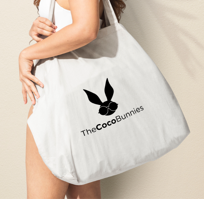
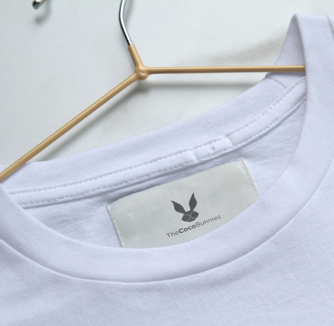
The Coco Bunnies’ grand plan: to take over the world with merch that goes beyond eyewear. So the branding we developed would need to do the same. Whether it was emblazoned across a full-size tote bag or printed on a teeny tiny clothing label, we made sure The Coco Bunnies brand was as legible as it was beautiful.
Of course, we can’t talk brand without talking logos. And The Coco Bunnies logo is a particularly memorable one,
not only for the adorability factor (admit it… it is pretty cute) but also for the way it models the company’s primary product front-and-centre without taking focus away from the statement the company wanted to make. It demonstrates quality without sacrificing an iota of fun.
 Back
Back
 get in contact today