Re-Branding
Advertising
April 2019
Jan 2021
Legacy matters to Pinheiro Realty Ltd. Brokerage. Since Joe Pinheiro opened its doors in 1979, the London, Ontario-based brokerage has stood for three values: integrity, honesty and service. They’ve built strong roots in their community, which grew to recognize the Pinheiro “For Sale” signs on front lawns across the city. But the future matters, too. That’s why Joe’s son Rick Pinheiro approached us to give their brand an upgrade that reflects their past… and future.


Lorem ipsum dolor sit amet, consectetuer adipiscing elit, sed diam nonummy nibh euismod tincidunt ut laoreet dolore magna aliquam erat volutpat.
A B C D E F G H I J K L M N O P Q R S T U V W X Y Z
a b c d e f g h i j k l m n o p q r s t u v w x y z
0 1 2 3 4 5 6 7 8 9 .
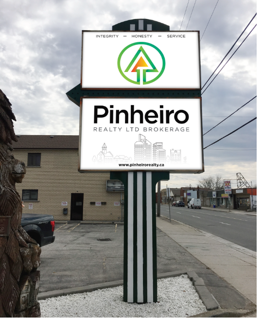
We started by creating a new logo that playfully echoes the original – a tree encircled in the letter “P” - while also signifying upward movement and the comfort at the heart of a new home. The green-and-orange combo is another call-back to the brokerage’s past, modernized with ample white space and clean gradients that make it pop forward from the page, sign or screen. It’s a perfect pairing that conveys fresh opportunity, new growth and warmth.
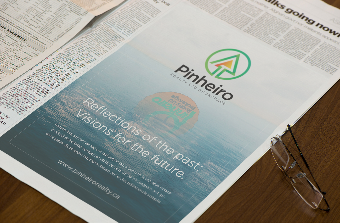
Rebranding is a balance between creating something new, but not so new that people no longer recognize who you are or what you’ve built. It’s looking at a business, its history and its people with fresh eyes. That’s a balance we’ve struck perfectly across their signage, business cards, stationery, ads and more – uniting the Pinheiro Realty Ltd. Brokerage of 1979 with that of 2021 and beyond.

 Back
Back
 get in contact today