Branding
Feb 2021
March 2021
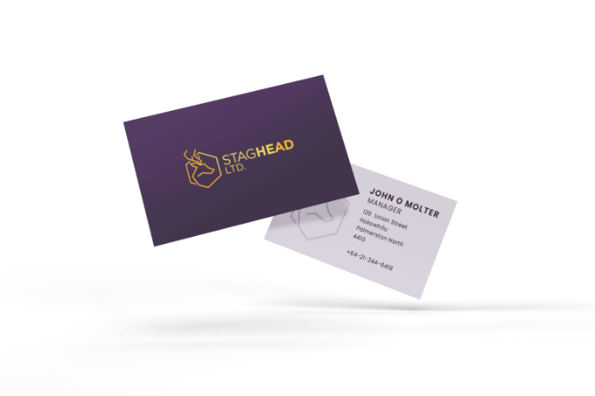
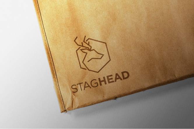
As a company that develops custom applications for business management platform Microsoft Business Central, Staghead needed a brand that shows its expertise at-a-glance and inspires confidence among customers-to-be, whether they’re big corporations or small businesses. A brand that’s unique and immediately recognizable. A brand that captures their mission of making businesses more flexible, productive and connected.


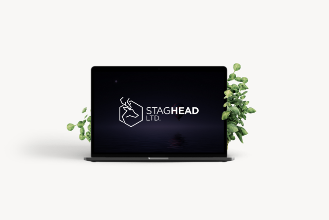
Colours convey emotion and meaning – no words required. Through the palette we selected, Staghead sends a message about what their customers can expect: a premium experience with a high-quality result. The interplay between warm and cool mixes energy with professionalism suited for businesses that mean business. Purple represents luxury, creativity and the imagination of their team, while gold is a subtle nod to the importance of the material as an electrical conductor that’s essential for many technologies.
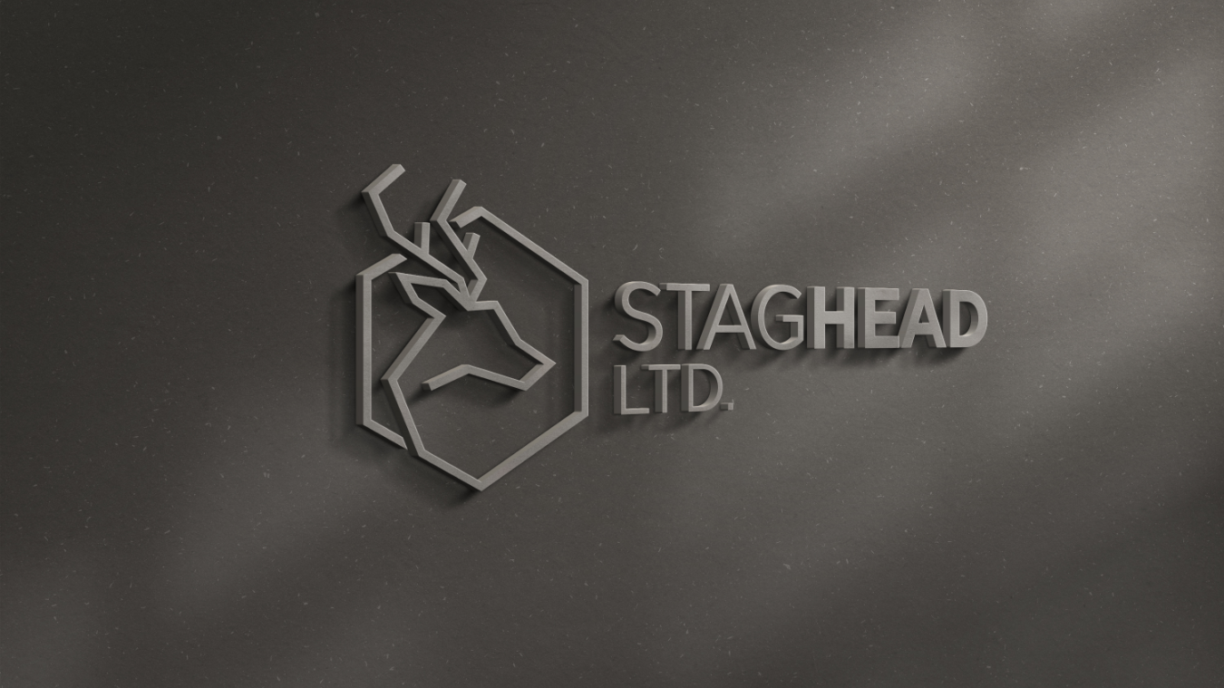
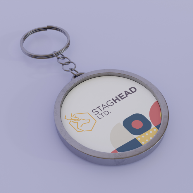
The logo blends the technological with the organic. The strong, clean lines aren’t just easily legible as a literal stag head; they’re also connecting, overlapping and branching, creating a delicate interplay that represents the complex logic of software development against the end-user simplicity of the final product they deliver. The stag head is enclosed and integrated within a hexagon, a shape that simultaneously evokes high tech and one of the most efficient structures found in nature.
 Back
Back
 get in contact today